
What the 3-minute deck view time really measures
When a founder shares an asynchronous presentation link, document analytics often reveal an unsettling reality: the typical review is over in minutes. Specifically, an average total view time of 3.2 minutes per deck review is reported by Papermark's pitch deck metrics report, though the publisher contradicts itself regarding its sample size and collection period, meaning the figure should be treated as an indicative vendor benchmark rather than an immutable market standard.
A three-minute viewing window means decision-makers do not read an asynchronous deck the way they read an operational brief or an investment memo. They skim. They scan titles, search for recognisable benchmarks, assess market clarity, and evaluate whether the business logic holds together under casual inspection.
Asynchronous reading is an exercise in filtering. Venture investors, strategic partners, and enterprise buyers review dozens of inbound proposals weekly. Their primary objective during an initial pass is not to uncover hidden nuances, but to determine whether the proposal warrants a live conversation. When a deck fails to produce that verdict within the first few moments, the session ends.
Diagnosing where asynchronous decks lose reader momentum
Reader drop-off in an asynchronous deck rarely happens at random. It follows predictable friction points where the narrative stalls or asks the reader to work too hard to decipher the point.
The opening slide bottleneck
The steepest engagement drop occurs immediately at the start of the document. The first page receives significantly more attention, with investors spending more than twice the time compared to subsequent pages according to Papermark's pitch deck metrics report.
This concentration of attention on the first slide represents an immediate filter. Decision-makers spend that time deciding whether to commit mental energy to the remaining slides. If the opening page features ambiguous brand slogans, dense corporate phrasing, or an unclear category definition, the reader loses orientation. An effective first page must establish who you are, what category you operate in, and the specific shift in the market that makes your solution urgent.
The middle slide swamp
If a reader clears the opening pages, the next danger zone sits in the transition between the problem and the business mechanics. Decks frequently lose readers when they switch from high-level vision to an uncurated catalog of product screenshots or disconnected execution updates.
When every slide attempts to introduce multiple competing ideas, the reader experiences cognitive friction. Without a live presenter to guide emphasis, the reader's eyes wander across unstructured bullet points, cannot identify the governing takeaway, and close the browser tab.
The 5-to-7-idea discipline for asynchronous documents
Overcoming the three-minute threshold requires ruthless editorial prioritization before touching slide layout. A useful baseline comes from Kevin Hale, who advised startup founders to identify the 5 to 7 most important ideas people should know about their startup, as detailed in Kevin Hale's guide on the Y Combinator blog.
Hale derived three guiding principles from this constraint:
- Legible: Typography and layouts must be readable without zooming or straining, using strong contrast and uncluttered structure.
- Simple: One central idea per slide, eliminating competing elements that distract from the core thesis.
- Obvious: The point of the slide must be intelligible at a glance, without requiring a presenter's voiceover to explain what the graphic represents.
Applying this discipline to an asynchronous deck creates immediate clarity. The most popular deck length spans 9 to 16 pages, representing 49% of all pitch decks according to Papermark's pitch deck metrics report. If your document contains a dozen slides, but you only have five to seven core ideas to communicate, every single slide must either deliver one of those critical points or directly reinforce it. Any slide that exists merely to show extra technical architecture or secondary features represents narrative bloat that invites the reader to drop off.
Pitch decks versus due diligence materials
A common reason asynchronous pitch decks become unreadable is category confusion. Founders often attempt to turn a pitch deck into an exhaustive due diligence dossier.
A pitch deck and an audit archive serve fundamentally different functions:
| Document type | Primary objective | Typical reader behavior | Key design constraint |
|---|---|---|---|
| Pitch deck | Secure an exploratory meeting or committee review | Rapid scan seeking strategic narrative clarity | High legibility and single-idea slides |
| Due diligence archive | Verify operational, legal, and financial assertions | Methodical line-by-line examination | Exhaustive completeness and structured documentation |
When readers want to verify cap tables, historical revenue recognition policies, or detailed technical security architectures, they do not want that data shoehorned into an eighteen-point font slide layout. They expect that documentation to reside in a dedicated data room or financial appendix.
Conflating these two formats damages the deck. Loading an asynchronous deck with dense financial tables or contract terms slows the scanning speed, obscures the underlying growth thesis, and causes decision-makers to abandon the deck before reaching the traction slides.
Structuring the narrative path before generating slides
When a presentation fails to hold a reviewer's attention, the underlying failure is rarely graphic design. Established design platforms and slide builders like Canva Pro are perfectly adequate when a team already possesses a finalized narrative and simply needs to arrange visual elements, as explored in this review of Canva Pro vs Ember Creation for B2B Pitch Decks.
The real breakdown happens earlier, in the structural hierarchy of the argument. Adding polished graphics or decorative illustrations to an unfocused argument only produces visually appealing confusion.
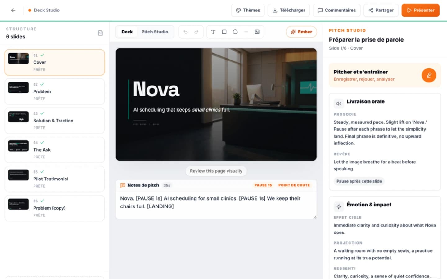
This structural hurdle is where Ember focuses its approach. Rather than acting as a simple slide generator, Ember analyses the substance and structures the narrative path before producing slides. By isolating the core logical sequence first, it ensures that every page earns its place in the sequence, helping founders build a presentation that moves a decision forward instead of losing momentum in the first three minutes. Founders looking to test this structured approach can explore the Ember pitch deck builder to align their narrative before finalizing slides.
Sources
FAQ
Mini audit
Test your Pitch Deck
Get an initial diagnosis of substance, form and impact.